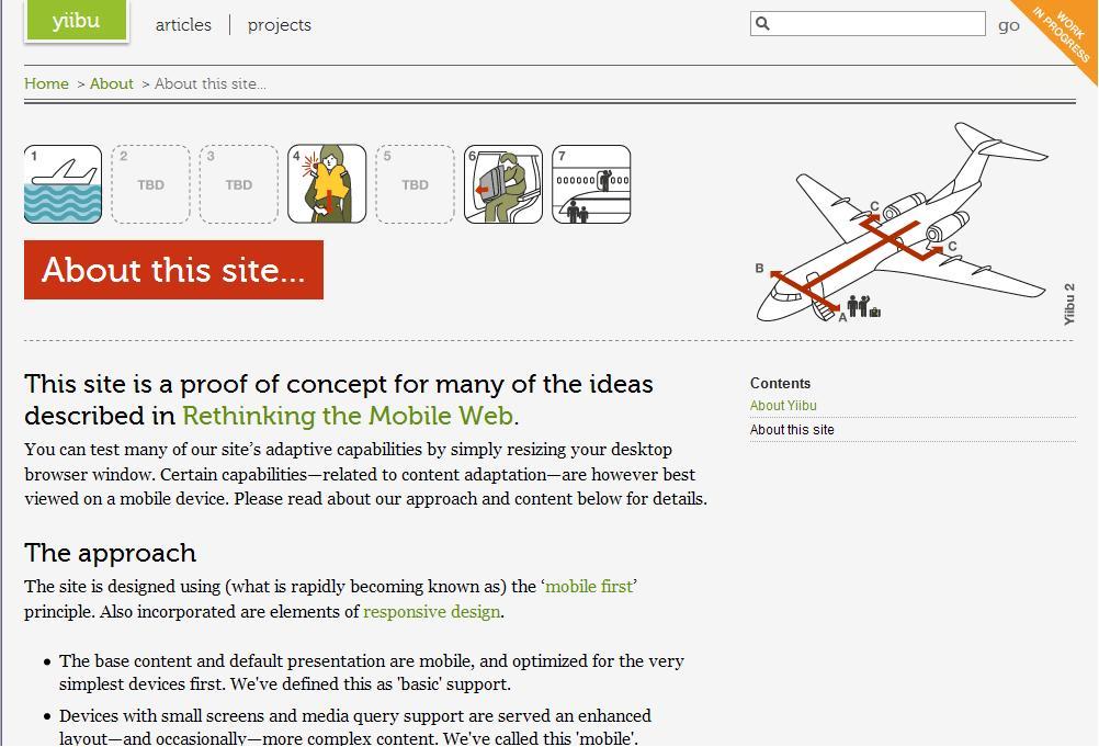
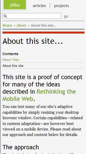
yiibu.com: This site is a proof of concept for many of the ideas described in Rethinking the Mobile Web. You can test many of our site’s adaptive capabilities by simply resizing your desktop browser window. Certain capabilities—related to content adaptation—are however best viewed on a mobile device.
The site is well worth taking a look at (make sure to resize your browser to test it out). It shows how it is very possible to design a single set of pages that render one way on a large screen and a different way on a smaller screen.
It goes from this

To this

Very Cool
saya sangat suka banget dengan informasi ini
trimakasih banyak kawan untuk informasinya